Park Properties Housing Association (PPHA) is a leading for-profit housing association in the UK, providing quality affordable housing across the country. After being acquired by HSPG in 2020, the need for a fresh brand identity became clear. The goal was to bring cohesion to HSPG’s group of brands, while also establishing a distinct identity for PPHA within the industry.
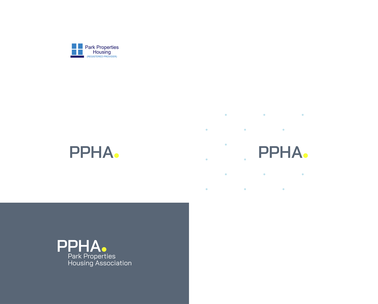
Formerly known as Park Properties Housing Association, the name was not only heavy to say or type but also did not effectively represent the Group.
Time is crucial when searching for a new home. The streamlined and professional “PPHA” allows for quick online searches and provides an immediate solution. The enlarged and bright full stop in the logo offers a reassuring end to the search for a future home.
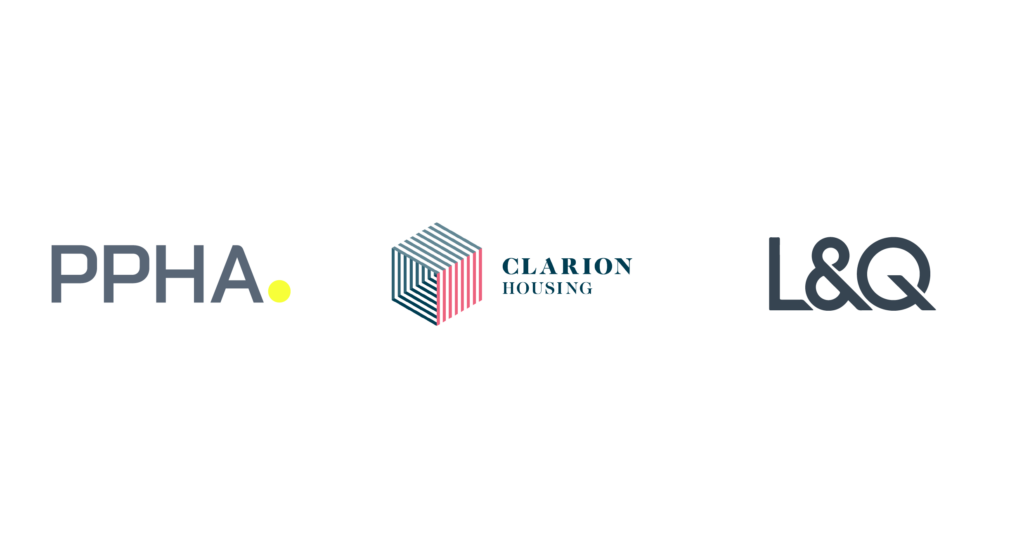
While many similar companies utilise generic blues to communicate trust and reliability, PPHA saw an opportunity to stand out with a bold hero colour. By leading with a vibrant yellow, PPHA aims to distinguish itself in a sea of sameness.
One of the key visuals in PPHA’s brand identity is a dotted background that can be seen as a grid or a point-to-point line drawing, symbolising each simple step to a new home.
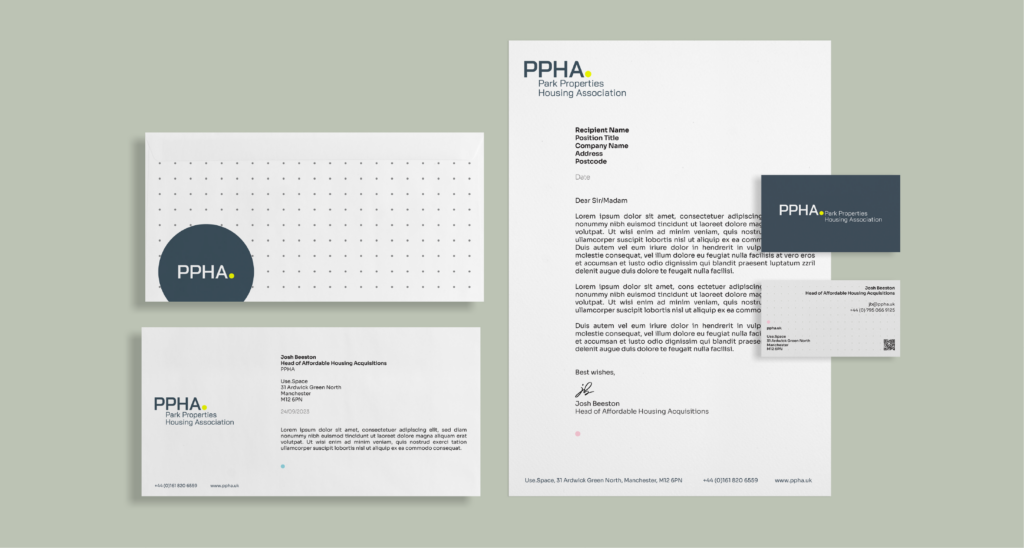
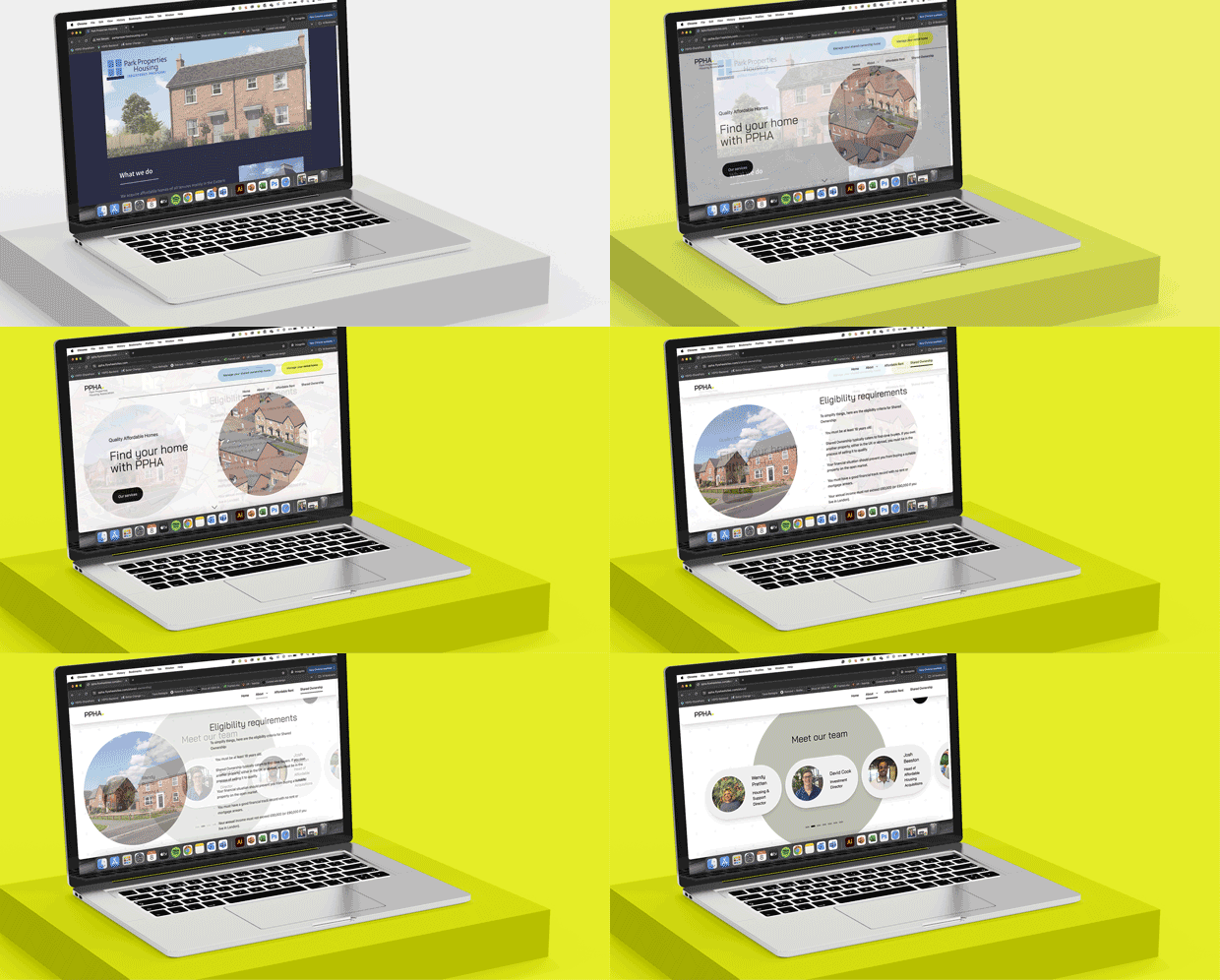
As a result of the rebrand, PPHA has launched a new website along with a new social media presence, aimed at assisting homeowners in finding, acquiring, and living in their new homes.
We’d love to know what you think of PPHA’s new and improved brand, whether you’re a customer in one of our homes, a partner or simply taking a keen interest in the affordable housing space!
Get in touch via our Contact us to hear more.


